The Subconscious Power of Visual Palettes
In the realm of professional video production, the most effective storytelling tools are often those the audience never consciously notices. Color psychology is a primary example of this "invisible" influence. By strategically selecting hues for production design and post-production grading, creators can trigger involuntary emotional responses before a single line of dialogue is spoken. For businesses and educators, mastering these visual cues is essential for reducing friction in communication and ensuring that marketing or training materials resonate on a deeper psychological level.
According to insights from No Film School, color functions as a silent character in a script. It dictates the mood of a scene, defines the world-building, and signals shifts in a narrative arc. While filmmakers have used these techniques instinctively for decades, the modern media landscape requires a more calculated approach to color to stand out in high-speed digital feeds.
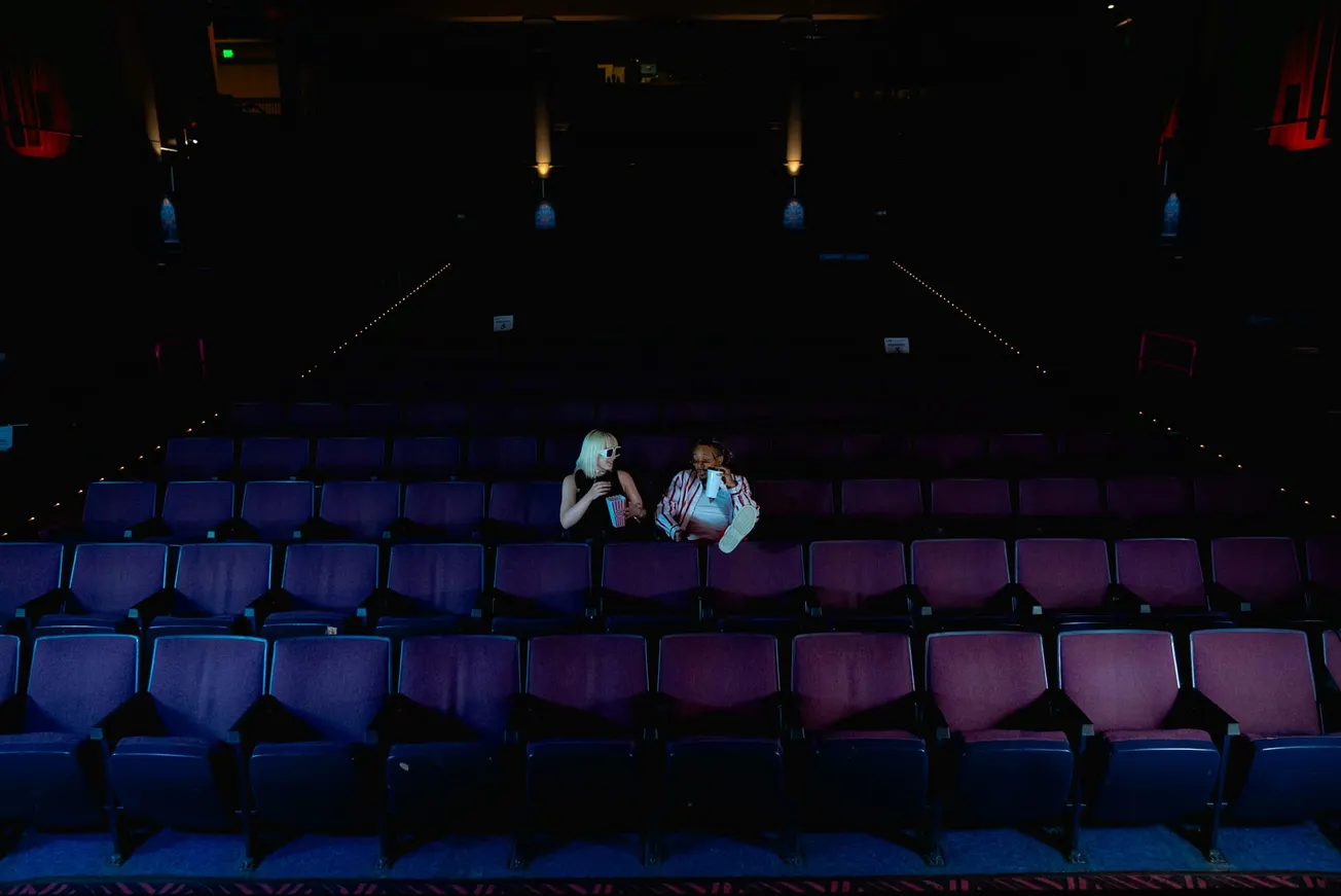
Whether producing a feature film or a 30-second social media advertisement, the color palette is a foundational element of the viewer's experience.
Emotional Associations and Technical Applications
The cinematic color wheel serves as a roadmap for emotional resonance. Warm tones, such as reds, oranges, and ambers, are frequently used to denote energy, passion, or danger. Conversely, cool tones like blues and greens evoke feelings of calm, stability, or clinical detachment. In a business context, these associations are vital for brand storytelling. A technology company might utilize a blue-heavy palette to foster a sense of security and innovation, while a lifestyle brand might lean into vibrant oranges to project enthusiasm and warmth.
Technical research suggests that these responses are often rooted in biology and cultural history. For instance, yellow is frequently associated with optimism and sunshine, but in certain cinematic contexts, it can also signal illness or hazard. The effectiveness of a color depends entirely on its relationship to the story and the surrounding environment. For creators, the goal is not just to make a video look "cool" through a generic filter, but to ensure the color grade feels true to the emotional state of the content.
Practical Workflows for Pre-Production and Post-Production
Integrating sophisticated color theory into a production workflow does not require a massive budget. It begins in the pre-production phase with the creation of a color script or a visual timeline. This allows the production team to map out how the palette will evolve alongside the story. For example, a character’s journey from isolation to community can be visually represented by a transition from desaturated grays to saturated, warm tones. This deliberate planning ensures that costume design, set decoration, and lighting all pull in the same direction.
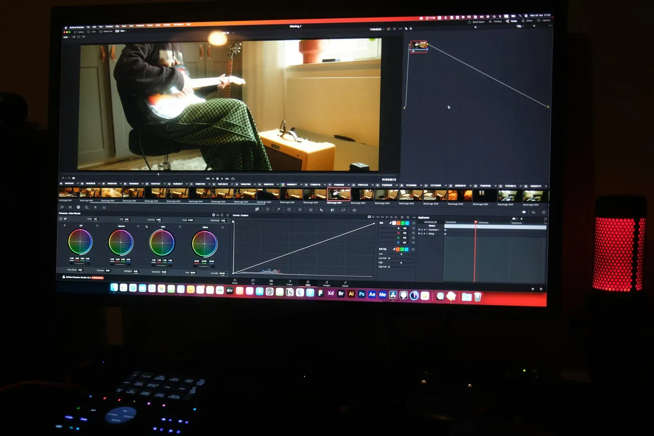
In post-production, color grading should be treated as a narrative tool rather than a cosmetic one. Modern editing software, such as DaVinci Resolve or Adobe Premiere Pro, provides advanced wheels and curves to isolate and manipulate specific colors. A marketing team can use these tools to subtly emphasize brand colors within a video or to ensure that the skin tones of a speaker look healthy and natural. By maintaining a consistent color language across a series of videos, a business builds visual authority and makes its content instantly recognizable to its audience.
Expanding Authority Through Visual Consistency
For small businesses and independent creators, the strategic use of color psychology is a high-value way to improve output quality. It bridges the gap between amateur and professional production by adding a layer of intentionality to the work. When the visual palette aligns with the spoken message, the content becomes more persuasive and memorable. This alignment is a key component of effective brand storytelling, helping creators reach wider audiences without unnecessary technical complexity.
Navigating the nuances of visual media requires a balance of creative intuition and technical knowledge. By treating color as a core element of the production process, teams can create more impactful stories that drive engagement and build trust. To learn more about optimizing your video production and editing workflows, explore the latest guides at PodcastVideos.com. Detailed breakdowns of cinematic color examples can also be found through the expert analysis at No Film School.